I decided that I wanted to hide/remove the sidebar on mobile devices. To be able to do this I used this CSS code snippet below, and you can use this to do the same with your website.
@media (max-width: 720px) { #sidebar { display:none !important; } }
In our case, the break point for the sidebar was at 720px. You can work this out for your website by installing a chrome extension Window Resizer which tells you the width of your browser so you know what number of pixels to set as the max-width.

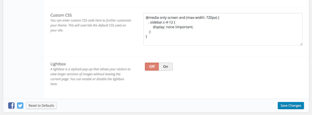
Most premium WordPress themes have a custom CSS option available in the theme options. As you’ll be able to see below we have added the CSS code into the Custom CSS field. We are using Schema Premium WordPress theme.
This now means that your sidebar won’t show on mobile devices and also any device under 720px. I hope this helps.
Get more stuff like this
Subscribe to our mailing list and get interesting stuff and updates to your email inbox.