If you run a WordPress blog and use a sidebar, then you’ve by no doubt used the Q2W3 Fixed Widget at some point in time. This basically allows you to enable any of your widgets to have a fixed location, so when you scroll down the page it stays in the same place. The gif below shows you this in action on our blog, when we enable a fixed widget on the last item in our sidebar.

Unfortunately, when you go to view this on mobile, it doesn’t work the same way. The fixed widget jumps up and down the screen as it’s trying to enable the fixed position. I’ve been looking for a solution to this issue for a while and after a bit of looking around on the Internet, I found out there is actually a built-in feature within the plugin that actually solves this issue.
If you go to the Fixed Widget options page, there is an option to disable this for mobile and tablet should you want to.
Appearance > Fixed Widget Options
The option you are looking for is “Screen Max Width”. In this field, you are going to type the number of pixels you want at which the breakpoint will happen.
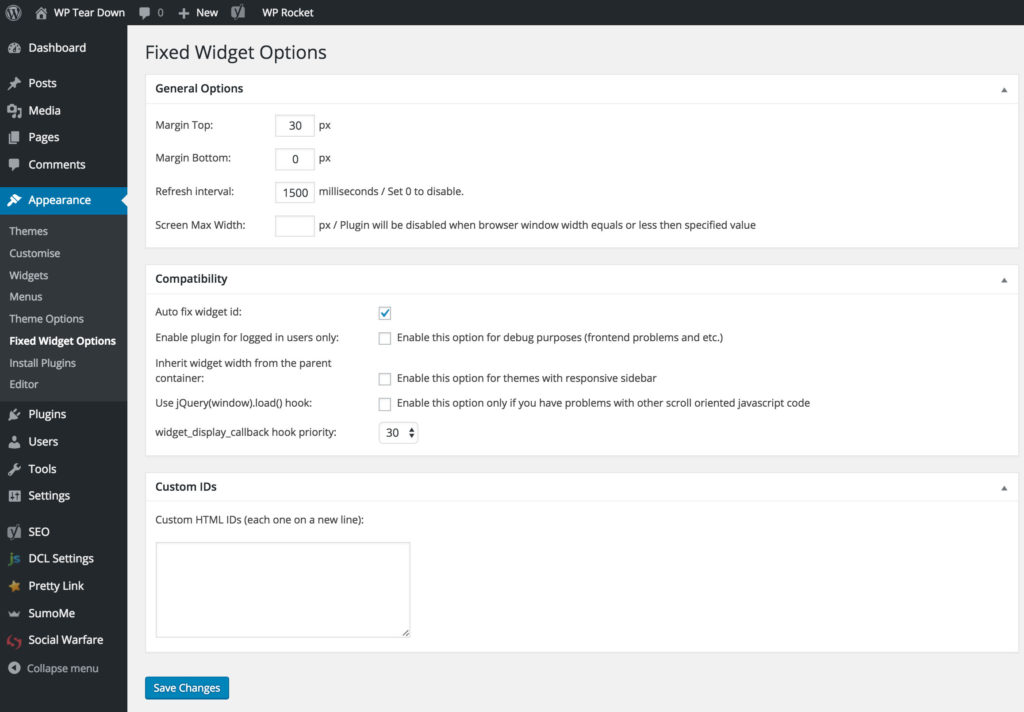
For our site, I’m going to set the screen max width to 719px. This basically means that when the screen size is below 719px (as in our case), the fixed widget element will be disabled, which is great for mobile and small tablets. To work out what size you want to set your max screen width to, you can install a chrome extension Window Resizer which tells you the width of your browser so you know what number of pixels to write in the “Screen Max Width” box.
You want to resize your browser to make it smaller and when you hit the breakpoint for your site take note of the width as this is what you’ll want to write into the “Screen Max Width” box. What I mean by breakpoint is when the site changes its layout such as: the sidebar is no longer at the side and is moved below the content.
Doing this will make your mobile user experience more user-friendly. Usually, you enable the sticky widget feature to a Call to Action. Doing this simple change of adding a max screen width can dramatically increase your mobile Call to Action conversion rate.
Get more stuff like this
Subscribe to our mailing list and get interesting stuff and updates to your email inbox.